Free-Market Anarchism Flag Proposal
Let them hoist the white flags. Our banners are black.
— Erik von Kuehnelt-Leddihn, Black Banners, 1954.
... and gold.
— Andrew S. Rogers, 2011.
The Design Explained
When I came up the idea for a flag to represent anarcho-capitalism years ago, I never imagined anyone else had done that before me. In fact, I suspected I was probably the only ancap-slash-vexillologist who would think there was any need for such a flag.
So imagine my shock and delight to find, while reading Murray Rothbard's The Betrayal of the American Right, that an anarcho-capitalist flag was unfurled at the Freedom School in Colorado in the winter of 1963-64 ... and that it was black and gold!
That flag, with gold in the hoist and black in the fly, is now well documented on Wikipedia and elsewhere and has become a de facto symbol of our point of view online, where I see it all the time in avatars and web graphics. Nevertheless, I have a fondness for my own black-over-gold design.
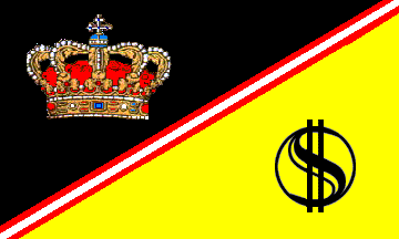
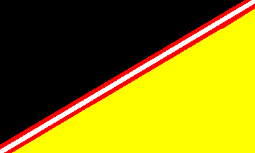
A black flag, of course, is a traditional symbol of anarchism, and it's no great leap to choose gold to represent capitalism. Arranging the colors on a diagonal felt more dynamic than a horizontal or vertical bicolor. The red-white-red stripe is a nod to Austrian economics, a cornerstone of free-market anarchist thought.
Gilding the lily, perhaps, I added Per Bylund's Libertatis Æquilibritas to the fly, and a crown in the hoist to represent personal sovereignty. Thus I ended up with a design I now think of, to borrow a term from the historic flags of France, as Anarcho-Capitalist Ancient.
The design I now prefer (except on my personal flag) is Anarcho-Capitalist Modern. It does away with the crown and Libertatis Æquilibritas but leaves the Austrian stripe. This results in a simpler and cleaner design that is less expensive to produce, yet still, I would argue, more interesting visually than the unadorned gold-over-black flag.
How to Get an Anarcho-Capitalist Flag of Your Own
I've been pretty gratified by the response my design has received. Not overwhelming, admittedly, but the people who have said something about it have been uniformly positive. A few have even used it as their avatar on Facebook or Twitter.
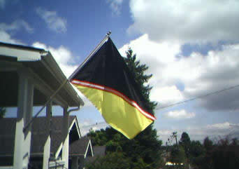
Occasionally, someone will ask if they can purchase one of these flags. At the moment, there is only one physical example of this flag. You can see it in the photo below. My wife had it made for me. Isn't she cool?
For now, at least, I'm neither able to produce nor interested in producing any for sale: there hasn't been that much demand. If you would like one, I hereby grant permission for any interested party to take an image of this design to their local seamstress or flag store, or to an online flag vendor, and have one made for your private use. All I ask is that you (1) give me credit if anyone asks who designed the flag, and (2) send me a photo of your flag "in the cloth."
Alternately, if you want an ancap flag, not just my idiosyncratic design, you have two options that I'm aware of.
One is Seth King of The Daily Anarchist. Seth is offering the traditional ancap flag defaced ("defaced" is a technical term, not a criticism) with the Gadsden rattlesnake and "Dont Tread On Me" motto. He also offers a black flag with a gold "AC" logo adapted from the anarchist circle-A design. He has mentioned he hopes to make the undefaced flag available for purchase in the future.
The second option I know of is ebay seller "tommy_flags," who (as of this writing) is offering an inexpensive polyester version of the traditional flag, as well as a Gadsden-inspired design that's different from Seth's.
Finally, I should note there are several people on Cafepress or Zazzle who will sell you anarcho-capitalist flags printed or embroidered on shirts, mouse pads, and other items. (One of them is using a black-over-gold design with the Libertatis Æquilibritas in the fly. I can't say for certain he took my design, stripped out the crown and the Austrian stripe, and started selling it himself, but it sure looks that way to me.) The only one of them I can absolutely recommend is LibertyManiacs, who interestingly also tend to use a black-over-gold design. Check out their many, many non-flag items too. I have purchased two Ludwig von Mises posters from them and have been very satisfied.
FLAGS, 1967
How well they flew together side by side
the Stars and Stripes my red and white and blue
and my Black Flag the sovereignty of no
man or law! They were the flags of pride
and nature and advanced with equal stride
across the age when Jefferson long ago
saluted both and said, "Let Shay's men go.
If you discourage mutiny and riot
what check is there on government?"
Today,
the gaudy flag is very grand on earth
and they have sewed on it a golden border,
but I will not salute it. At our rally
I see a small black rag of little worth
and touch it wistfully. Chaos is Order.